
Modern, Powerful and More Visible

You may have noticed that some things have changed about Welthungerhilfe's visual identity. The most prominent new features are the logo, the font and the color scheme. On this page you will learn how and why we developed Welthungerhilfe's new design – a process involving the entire organization and many supporters.

The previous Welthungerhilfe logo on the left and the newly designed one on the right.
Welthungerhilfe's history began in 1962. We were founded as part of the the UN Food and Agriculture Organization's groundbreaking and global Freedom from Hunger Campaign. Welthungerhilfe was and still is politically and religiously independent. Over the following 60 years, we have grown into one of the largest private aid organizations in Germany and have established a broad presence in German society through our donors, supporters, and member organizations.
Shared Values Across Continents
Our vision is a world in which all people have the chance to exercise their right to self-determination, dignity and justice – free of hunger and poverty. In pursuit of this goal, Welthungerhilfe has continuously evolved and developed. From a small office with four employees in Bonn, Germany, we have grown into an organization with more than 3,100 employees from 90 nations working in 36 countries.


We have asked ourselves how we can improve the visibility of Welthungerhilfe in an increasingly complex world. Together with our colleagues in Germany and abroad, as well as our partners and stakeholders, we have discussed what makes our organization tick and our common uniting values. Above all, it is respect, courage, transparency, responsibility for our actions, curiosity, and strong commitment that underpin our daily work around the globe. We are reliable, focused, internationally connected and open to new pathways.
What Exactly Has Changed?
The following video explains the background of the design process.
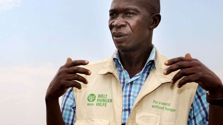
We want to implement this clearer and more concise identity in our brand presence, too. Most noticeably, we have changed our logo. The symbolism of the spike of wheat and the globe, which has been part of the brand since our foundation, has been carefully refined. The powerful symbol of the spike of wheat now merges with the globe, the awns extending outwards to become the meridians of the globe. Thanks to its clean, concise form, the visual is also clearly recognizable where it is most important today: in digital media, and side by side with the logos of our partners. The color green has remained, because it stands for reliability and hope. The color scheme is complemented with the color of wheat fields. The new signature font, with its soft edges and sturdy sides, reflects the brand personality.
In the international variant of the new logo, we have added "WHH". This is the abbreviation for Welthungerhilfe that is widely used in many of the countries we work in. Additionally, a tagline in the local language explaining Welthungerhilfe's mission is used internationally in combination with the logo: "For a world without hunger", "Pour un monde sans faim", 'Por un mundo sin hambre', etc.
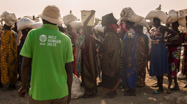
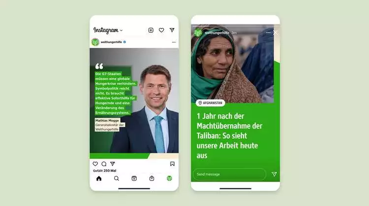
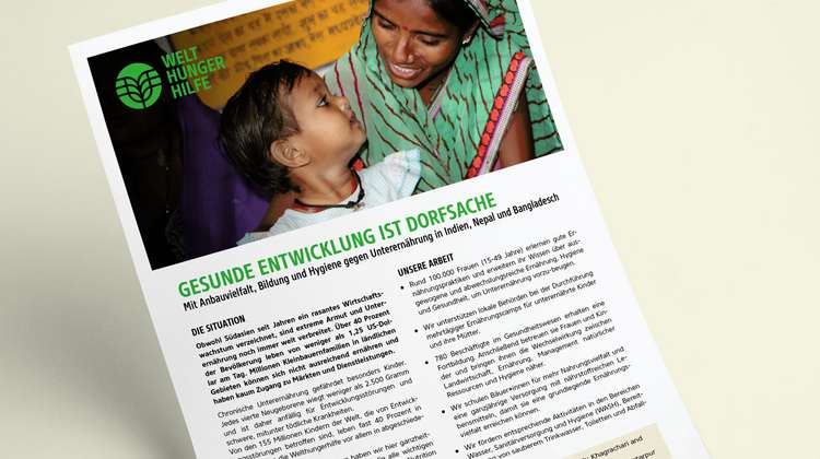
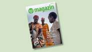
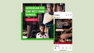
The new design will be premiered in Germany, first in our online presence and the Welthungerhilfe magazine, which we use to report on our work in projects across the world.
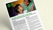
Examples: The New Design in Use


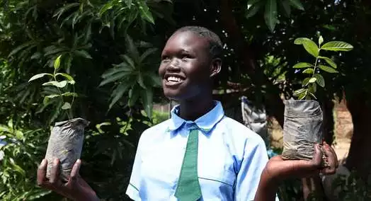
Welthungerhilfe turns 60 this year. It is one of the largest private aid organizations in Germany; politically independent and non-denominational. With courage and determination, it is striving for a world without hunger. Since it was founded on December 14 in 1962, 10,895 overseas projects in about 70 countries have been supported with 4.46 billion euros. Welthungerhilfe works on the principle of empowering people to help themselves: from rapid disaster relief to reconstruction and long-term development cooperation projects with national and international partner organizations.
FAQ
Why is Welthungerhilfe changing its design and logo?
In recent decades, Welthungerhilfe has become increasingly international. In 60 years, the small office with four employees in Bonn has grown into a non-governmental organization with more than 3,100 employees from 90 nations, working in 36 countries. This growth has spurred the continuous development of the organization. Our identity should therefore be reflected in a modern, sustainable brand image. The new brand identity matches the way we work today to realize our vision: reliable, focused, internationally connected, courageous, and open to new pathways. We have strengthened the logo graphic as the brand's visual identifier. With its clean, concise form, it is now easily recognizable where it is most important: in digital media, and side by side with the logos of our partners across the countries we work in.
What does the new logo represent?
The new corporate design reflects Welthungerhilfe's vision of ending hunger and poverty worldwide. The symbolism of the spike of wheat and the globe, which has been part of the brand since its inception, have been carefully refined and optimized for digital channels. The powerful symbol of the spike of wheat now merges with the globe, and the awns of the ear extend outward to become the meridians of the globe. The color scheme has been modernized to increase distinction and recognition. The soft edges and sturdy sides of the new signature font also reflect the character of the organization.
What was the process for changing the design?
We asked ourselves what employees in Germany and abroad think about Welthungerhilfe. What are the strengths and weaknesses of the organization? What common values unite us? And how do our partners, supporters and donors see us, as well as the people with whom and for whom we work? We conducted many interviews, invited people to workshops, and presented the results for discussion in digital exchanges with several hundred employees from every country we work in.
The participatory process that launched in 2021 brought Welthungerhilfe employees closer together. Those involved reformulated the essence of the brand and defined six core values that unite us in our daily work around the globe. This strengthened identity at the heart of the organization forms the basis of our modernized brand image.

